

How I redesigned the Savoir website 3 times
The story of a technical founder trying to be a designer
Full-Stack developer and founder at Savoir, I am passionate about documentation and hoping to share more about what I build.
As my last #4articlesin4weeks writeathon submission on my personal blog, I posted a small list of tips on logo design for technical people. I was going through the process of redesigning the Savoir website to be more on brand and it felt like the right time to share my own tips. I am not a designer, as the tips article may show, and I have to work with the skills that I have. I now have the chance to work with someone who can challenge my poor design decisions, but this also makes the design process even harder. I can't settle for what looks “good enough”, so getting feedback has been a very good tool for making improvements. Today, I'd like to share the story of how I redesigned the hero banner for the Savoir website and the many mishaps along the way.
The original design wasn't great
Imposter syndrome being what it is, I can't help but continuously question my design abilities. It's a fine line between looking at something you made from an objective point of view and unconsciously viewing that same thing more negatively than it really is. I find that line tends to get blurry the more I start at something. In the process of reviewing my own work, I may find a few things that stand out now but don't matter in the long run. For example, did you know the Savoir logo's eyes are not exactly at the same distance from the center of the logo? One is a few millimeters more to the right than the other. I wouldn't fault anyone for not noticing it, I only did with the help of a ruler. It's one of those situations where I had to seriously question if I was looking at this objectively. Did this small mistake make me a bad logo designer?
The same thing goes for the Savoir landing page's design. The initial version, built back in 2020, wasn't ugly, but it wasn't great either. It suffered from a lack of consistency, poor contrast, a bad choice of words that made people think we were selling a newsletter, and a poorly positioned layout that made the site look unprofessional.
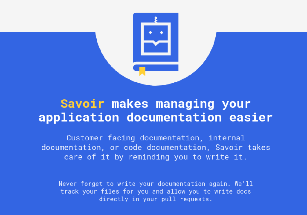 The first iteration of the Savoir landing page
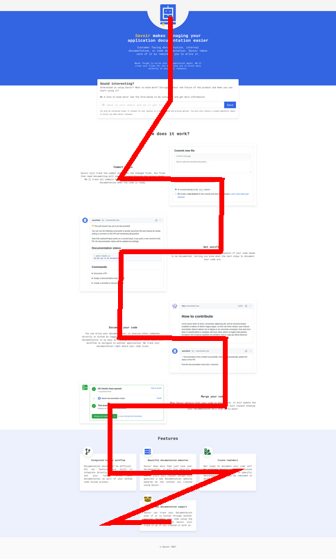
The bad layout decision and the bad flow of information were the main reasons why I started thinking of a redesign as soon as the page was hosted on Netlify. The core issue was the centered text and logo in the hero banner, which was then followed by a zig-zag "how it works" section, and a grid based features section. A viewer's eyes would have to jump around a lot, which isn't great for readability. There also was no clear explanation of what the product is about without having to scroll to the later section, which isn't a great first impression. The flow issue is very apparent when you draw a line of the typical "user story".
I had to get started somewhere
It took me more than a year to finally tackle the challenge of improving this design. During this time, I researched and designed. I drew a lot with Inkscape, made quite a few personal websites, and I bookmarked a lot of design inspiration. I also did a lot of work on the product's branding. The first version was mostly built without direction. I found some cool inspiration online after a few minutes of searching and got started. I hadn't considered what personality I wanted or what mood the page should create. I took some basic Bulma components and built something in a few days.
Going back to the drawing board, I now had a much better idea of the kind of personality and mood I wanted to see on the landing page. First and foremost, it should put a bigger emphasis on the git and chat bot nature of the product at the top of the page, that shouldn’t require any scrolling. After searching for inspiration online, I stumbled upon a thread of GitHub pull request flows. I really liked them; they showed the product flow really well and screamed "Git", which was exactly the kind of mood I wanted the product to convey.
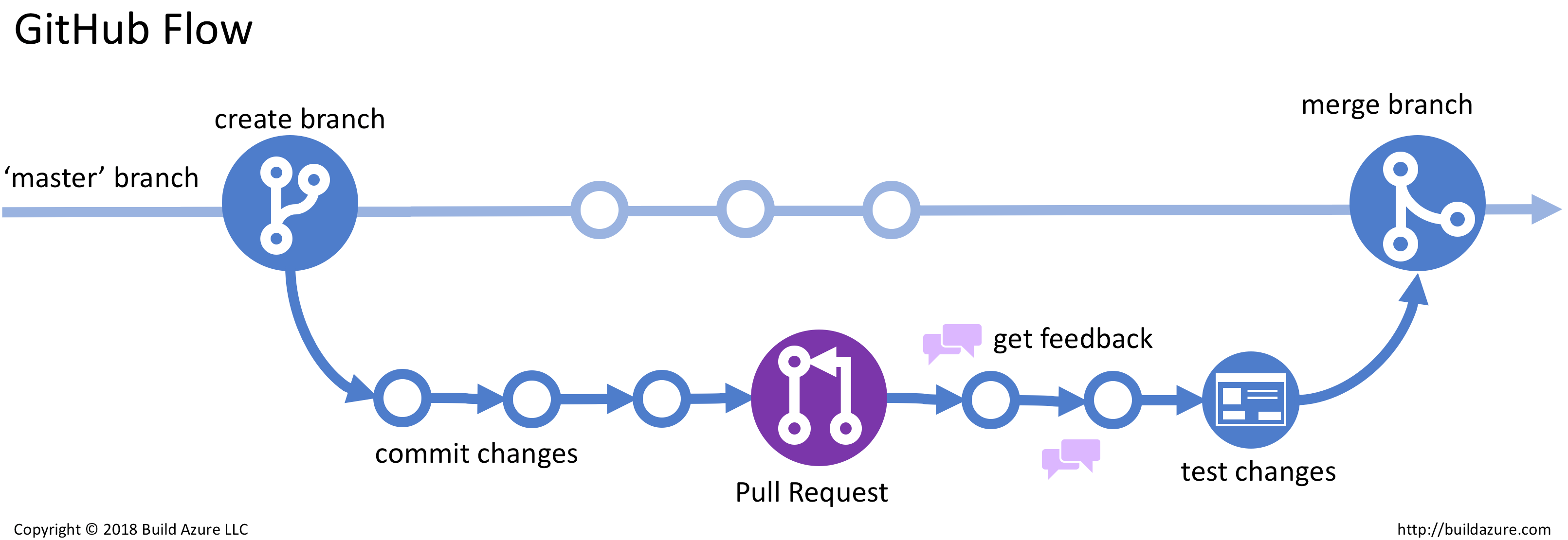
I took these images as inspiration and immediately started designing. I soon realized that even with years of using the tool, I never learned how to make a good looking curved line. They are not the easiest thing to do in HTML and I was convinced it would be easier to make in SVG, which I had to learn from scratch.
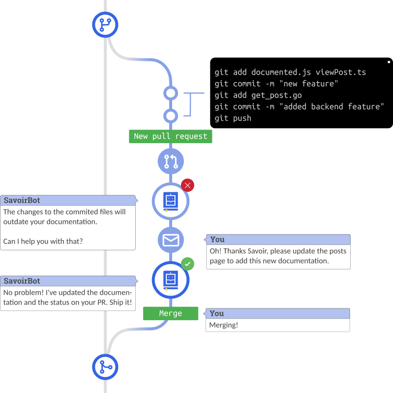
I strongly believe in failing forward. If I didn't have the ability to build this flow the first time, I would work on it until I got it right. After hours of work (yes, hours), I managed to build a custom pull request icon with some status checks. It wasn't great, but it taught me how to make nice looking curved lines and how to play with gradients. It was a good start. I also decided to draw it vertically instead of horizontally, to break away from the centered hero and instead follow the zig-zag pattern of the rest of the application.
Going too far in one direction
Armed with my new skills, I started sketching the exact flow I imagined in my head and began designing. The great thing about this kind of iterative process is how it enables experimentation. I had a slightly better flow and messaging in place on the website already, there was nothing wrong with trying something bigger. I had no idea if my ideas would work in practice. I had to apply them to find out.
 I tried, it took me 5 hours too
I don't think I'll make the news by saying that this version went way too far in the GitHub flow direction. With some adjustments, it could definitely look good, but I simply didn't have the skills to make this look better (The chat boxes are especially bad). It also showed me that larger doesn't equal better, the entire image would need to be very big to show the information properly. This would create a lot of empty space in the left column. I could make it horizontal, but suddenly we're back to the flow issues from the first version.
Learning from my mistakes
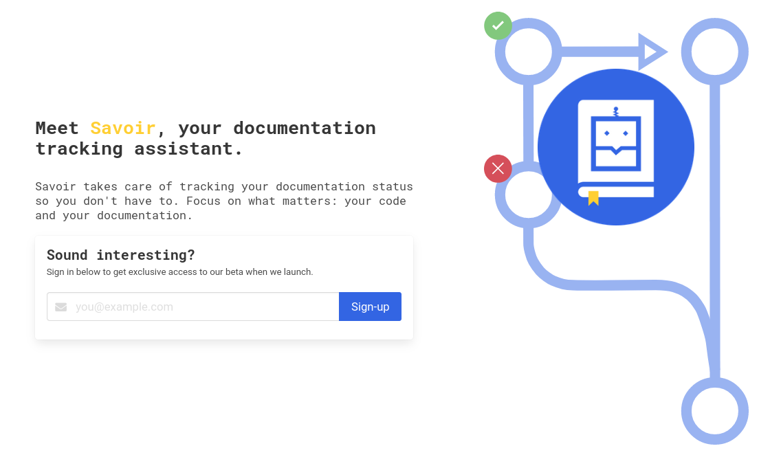
As soon as she saw the SVG version of the flow, Wajma Mohseni asked me: "can we compress it?". I wasn't sure if this could be possible; could I convey the pull request flow without representing it as two branches? Should I stick with the top to bottom branch flow after all? I had a hard time wrapping my head around this, but I decided to trust the advice I got. This taught me two things: 1. the GitHub-like flow is a good idea and shows what the product does at a glance 2. I'm not making the best use of my time by sticking with Inkscape. Don't get me wrong, Inkscape is an amazing tool, but I am a developer. If I want something to look good, I should build it in HTML and CSS, not SVG. Back on the internet I went to search for inspiration.
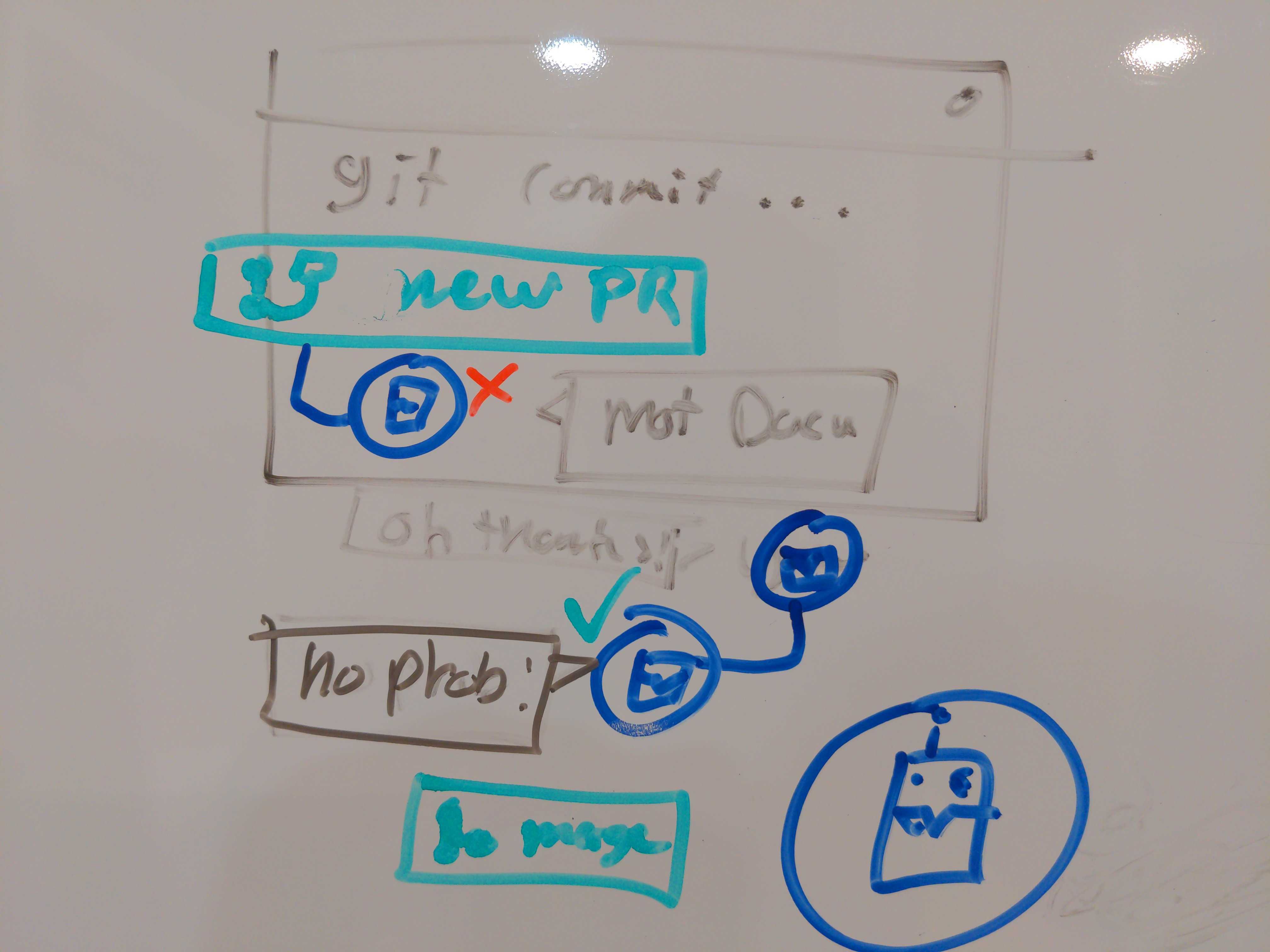
A constant in all my blog posts is that I really like sketching things down when I design. It helps clear my mind and my inability to draw makes it very easy to focus on the information over the looks. So I did just that. I went to my white board, aligned my monitor so it would show my inspiration board, and started sketching until I hit something I liked. It took some time, but shifting my perspective and having good inspiration really made things click.
 Crazy what you can do with 90 degrees turns
With this sketch in hand, I decided not to follow my previous instincts and went on CodeSandbox rather than Inkscape. It was time to use raw HTML and CSS (using React), and drop SVGs (At least for now). It went a lot smoother and, after some back and forth, I finally ended up with this.
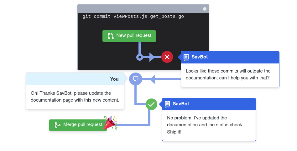
For someone who wrote to play to your strengths, it sure did take some time to apply my own tips. Saying it went a lot smoother is an understatement. As a developer with a good amount of frontend development experience, working with web technologies allowed me to create something great very quickly, then iterate on it without hitting my own skill limit. I also had the knowledge required to fix my own mistakes, like only using the px unit for positioning (That really wasn’t responsive).
As to how I built this compressed flow, it uses a CSS grid and lots of relative positioning to generate the arrows, lines, circles, and other components. It was initially built with only absolute positioning, but that made it very hard to scale and be responsive. The grid works amazingly.
Conclusion
Something I learned from this whole process is that I am definitely getting better at designing. Would I have a shot if I applied to be a junior designer? Probably not. It also taught me a lot about my own limits and design process. As we're now starting to look around for help from a designer, it is the right time to reflect on this month-long process, and think about what matters and what I can do better.
Do you also have some design stories you'd like to share? I'd love to read them in the comment below.
If what we are building looks interesting to you, please check our features and register for exclusive beta access on our website at savoir.dev. Feel free to also send me a message at info@savoir.dev, I'll be glad to answer any questions you have or give you a preview.
Savoir is the french word for Knowledge, pronounced sɑvwɑɹ.
